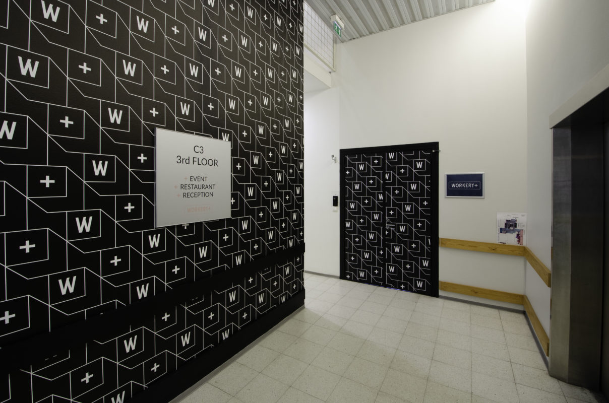
SIGNA is involved in the implementation of the YIT Workery+ Vallila redesign project
Workery+ is YIT’s new-age office and teleworking space where flexibility, comfort, and top-class services take the working environment to a whole new level. With the refurbishment, the old building in the heart of Vallila is now pulsating with new life and we were part of making this happen.
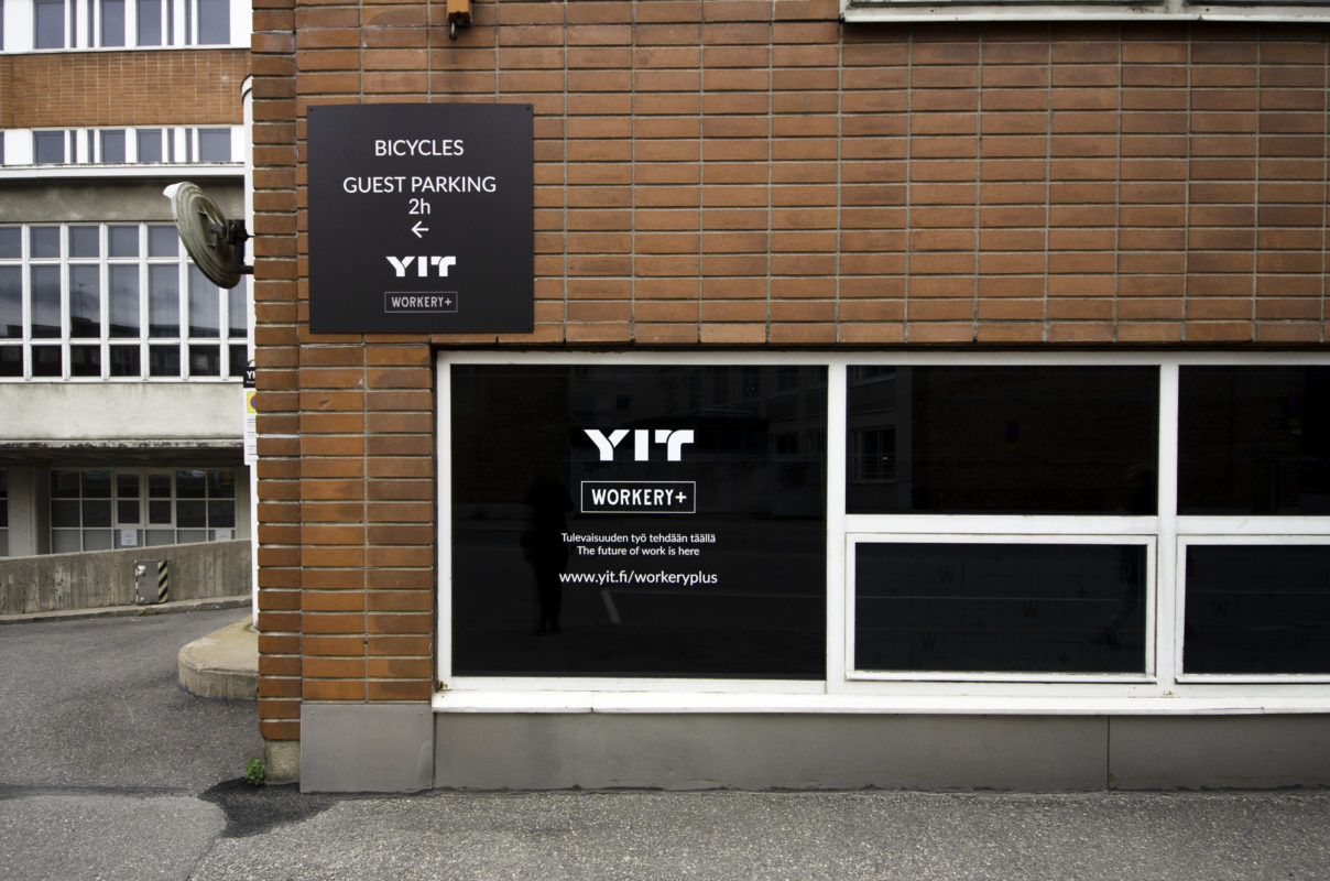
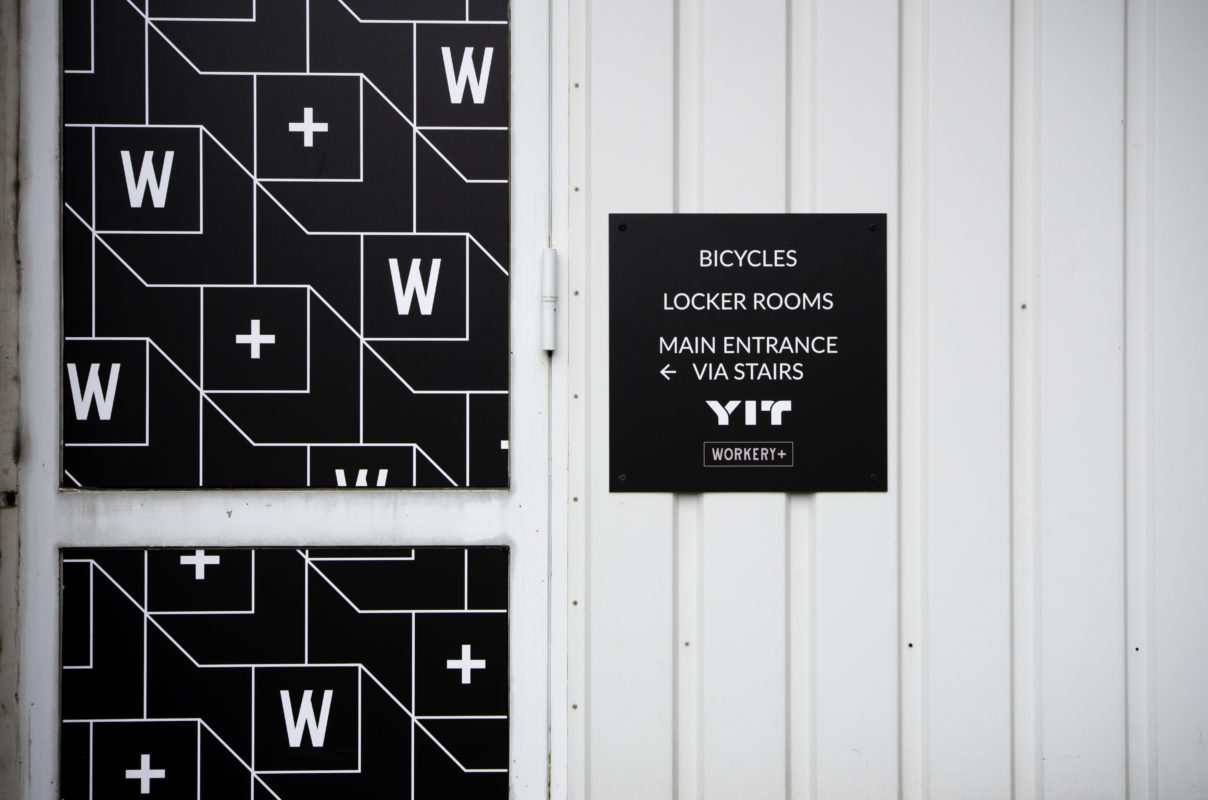
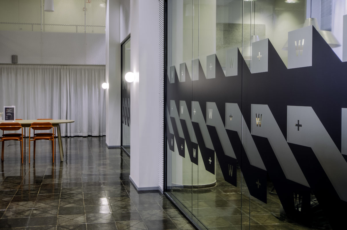
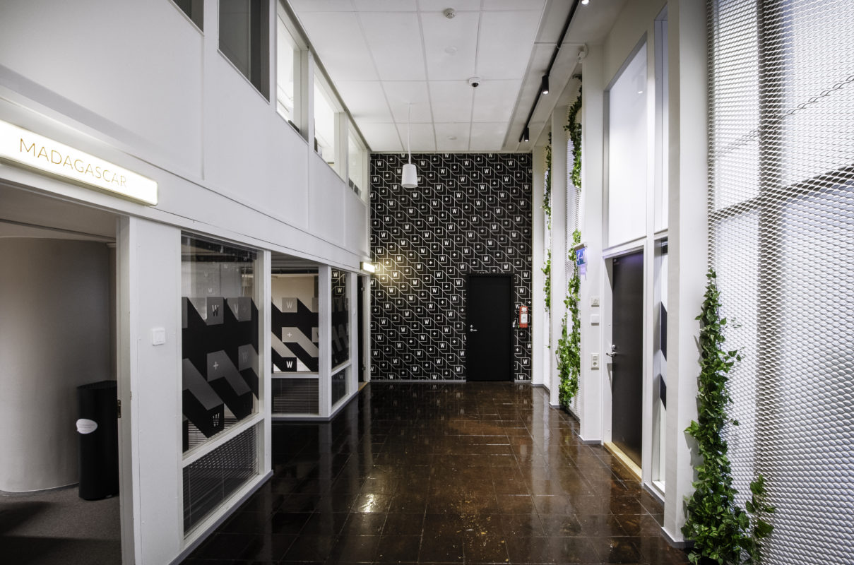
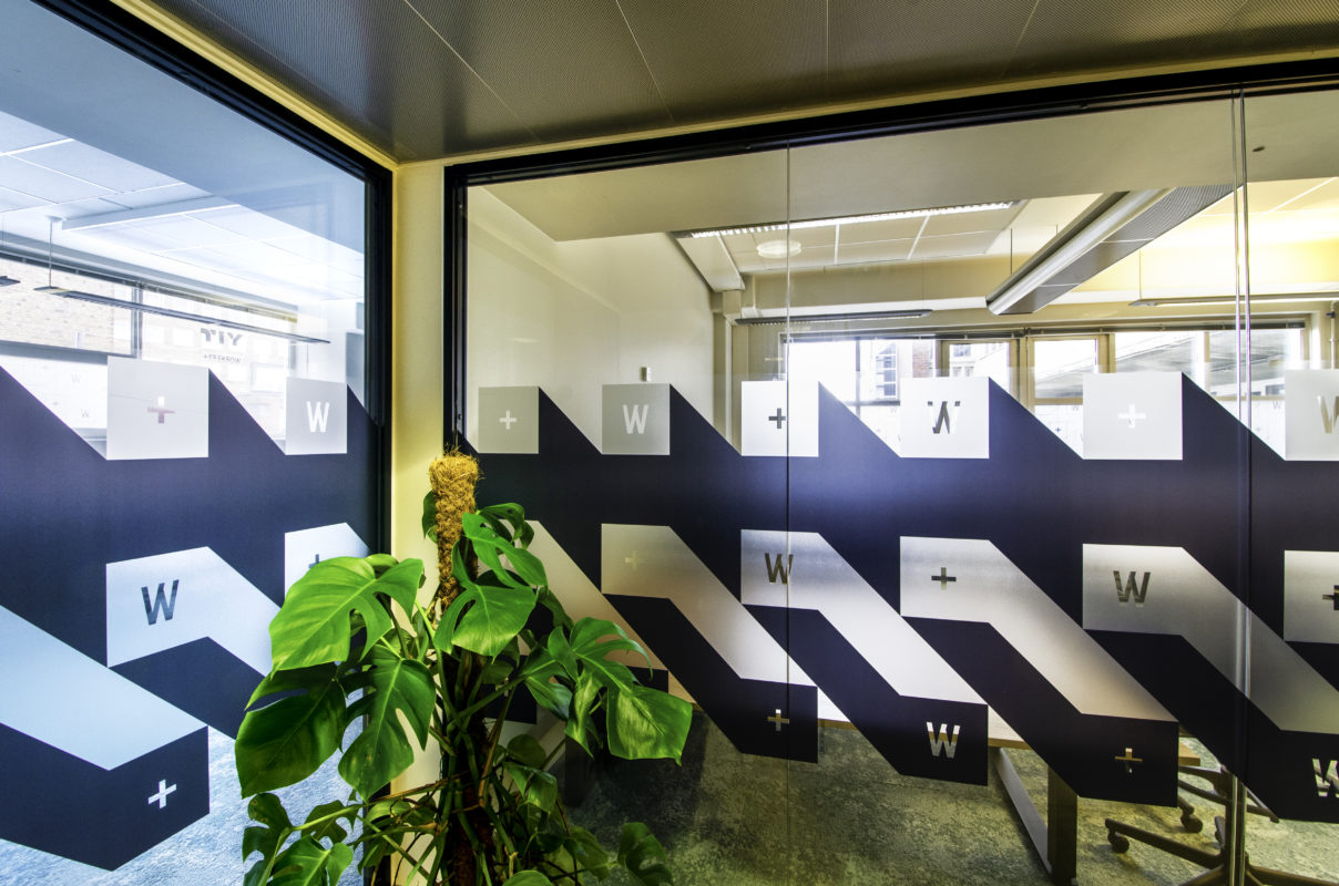
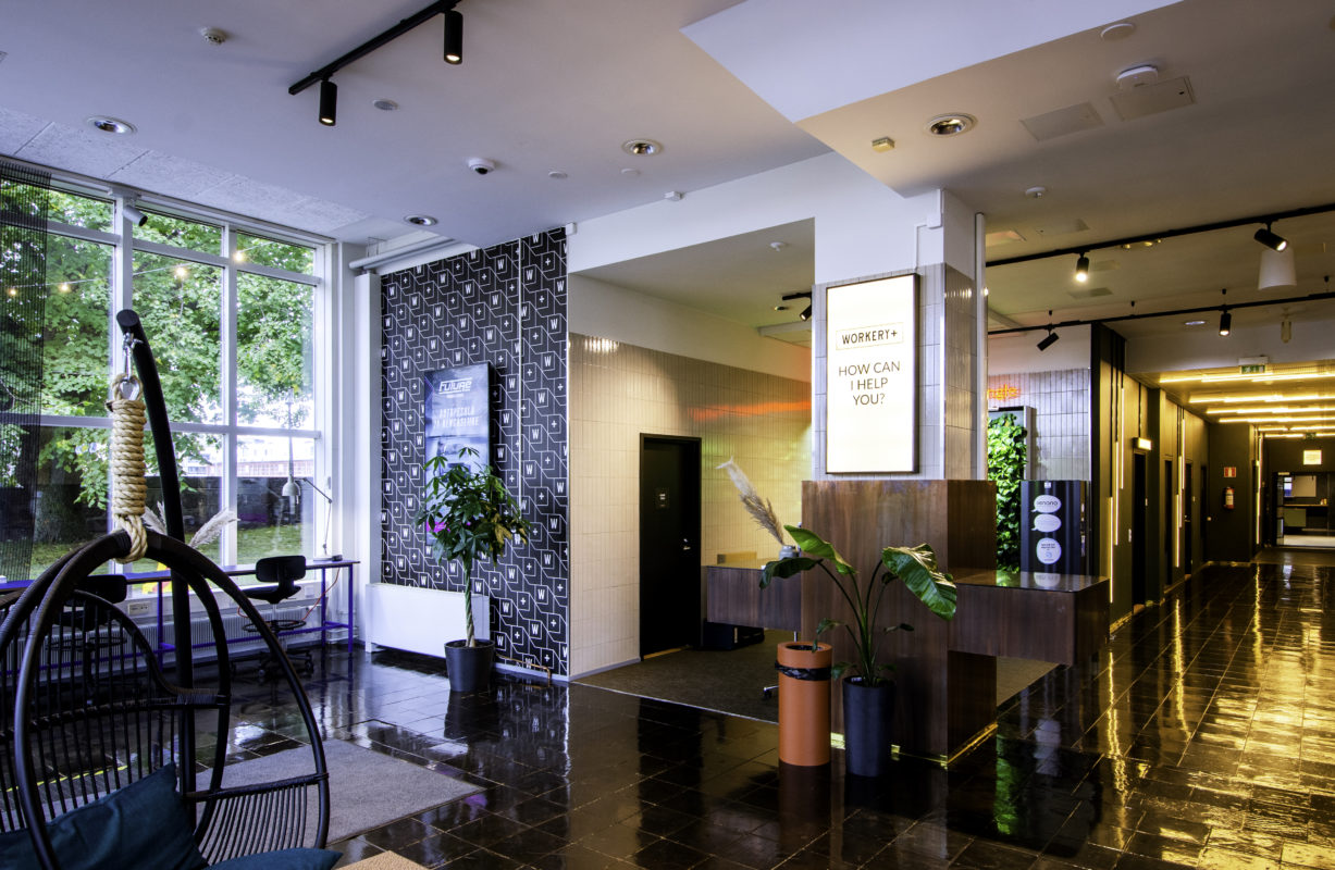
Signa Oy implemented and installed products on the premises in line with the raw, industrial feel of Workery+ Vallila. The brand identity is based on a combination of stylish black and white graphics and industrial-style interior elements. Wallpapers, glass films, signs, and lightboxes all follow the same graphic look. Black and white surfaces were applied in large patches to the staircases, and the door surfaces of the customer access doors were taped with Workery+ branded fabrics. The same pattern continues with glass walls, providing privacy in the meeting rooms.
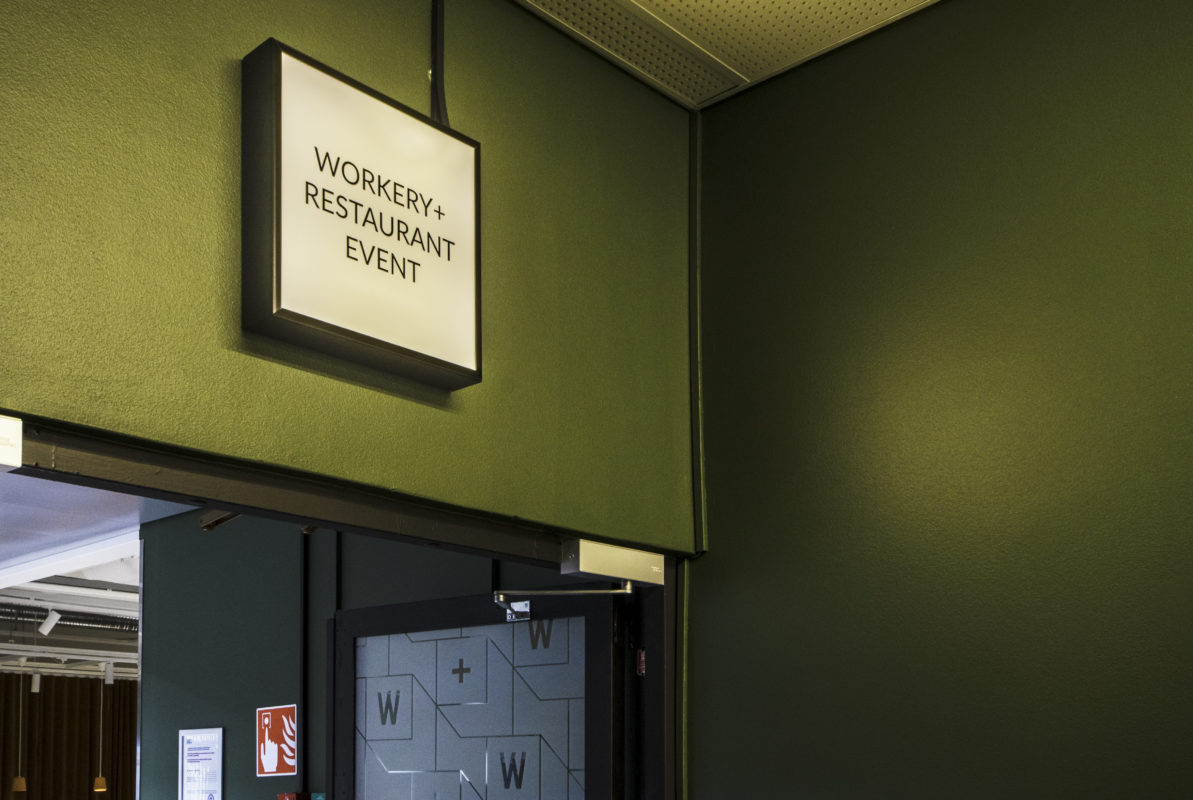
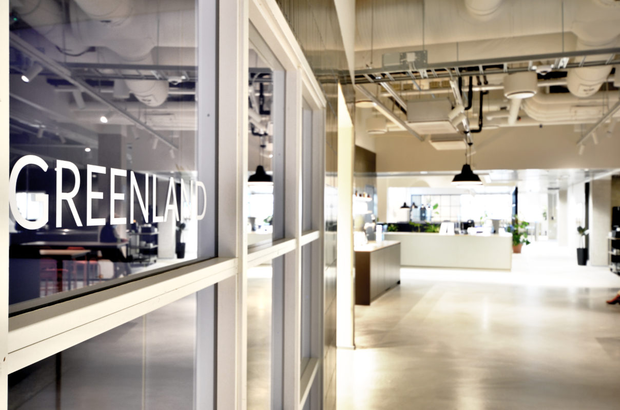
In a large building, a logical sign concept helps users to visualise the space. No matter the means of transport you use to arrive at Workery+ Vallila signs clearly guide you from the parking areas through different access routes to the interior. It was important for YIT that as many as possible of the functional elements in their premises were kept such as the wall lights in the corridors. They were installed above the conference room doors in the lobby to serve as illuminated signs. The conference rooms are named after jungles, deserts, and glaciers, and Signa Oy provided the fun names for the doors.
Outi Vaarala from YIT commented, “The final result was achieved quickly. Signs and expression surfaces tell the story of Workery+ which has only just begun. You are welcome to admire it on the premises!”

